foodpanda
Preply is a language learning app and e-learning platform that connects over 140,000 tutors teaching 50 languages in 203 countries worldwide with the concept of one-to-one human tutoring.
I’ve worked with the brand for a period of 6 months on developing their brand strategy together with the team, and transforming that strategy into visual concepts and creatives that will shape their internal and external identity in a world of increasing competition in the language learning world.
I’ve worked with the brand for a period of 6 months on developing their brand strategy together with the team, and transforming that strategy into visual concepts and creatives that will shape their internal and external identity in a world of increasing competition in the language learning world.
Deliverables
Brand Identity
Design and Art Direction
Design workshops
Performance Marketing
Product Refresh
Design and Art Direction
Design workshops
Performance Marketing
Product Refresh

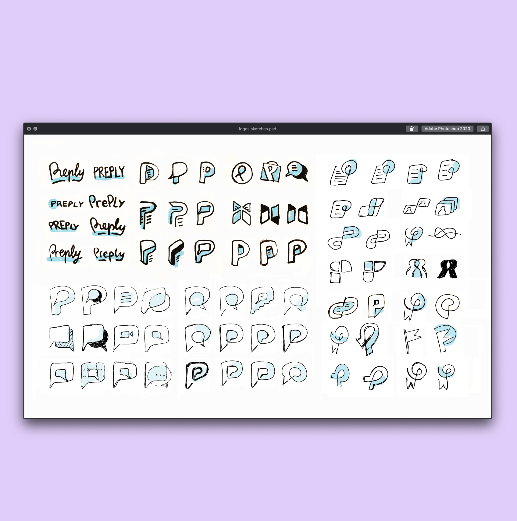
Our design concept is based on Preply’s purpose: to Connect people through learning (a bit like Nokia). The brand identity builds on the speech bubble hidden in the letter P that’s always going to be the most recognizable element of the icon.


Preply is all about language learning, online lessons and connection, so it took us a while to land on the right expression for the brand icon. From more literal to abstract icons, there was a balance to be found between something unique and special, and something instantly recognizable.


Preply OOH


Building on top of their brand platform, ‘connected by language’, we developed a series of devices and key visuals that would build momentum between photos, copy and other graphic elements.


credits