Client ········· PedidosYa LATAM
Medium ········· Digital & Print
Launch ········· June 2019
Design ········· Agnese Laguzzi,Ed Hendry
Medium ········· Digital & Print
Launch ········· June 2019
Design ········· Agnese Laguzzi,Ed Hendry
PedidosYa
PedidosYa is one of the biggest and most
loved online services in Latin America. Over 15,000 restaurants in over 400 cities use the service to deliver their food in Argentina, Uruguay, Bolivia, Chile
and Paraguay.

First things first
Although the brand has been one of the strongest in the Latin American region, with new brands like UberEats and Rappi coming to the market, PedidosYa approached our team with a two-fold brief - define a strong brand positioning to stand out from the crowd with a modern and vibrant brand, and also align the different markets and countries under a unified brand.

Three Key Challenges
01
Showcase the new positioning
02
Stand out from the competition
03
Deliver Consistency
01 — Showcase the new positioning
Research has shown that people still perceive the brand as doing only restaurant delivery, something that was underlined even more by the fact that the previous logo had a fork symbol in it.
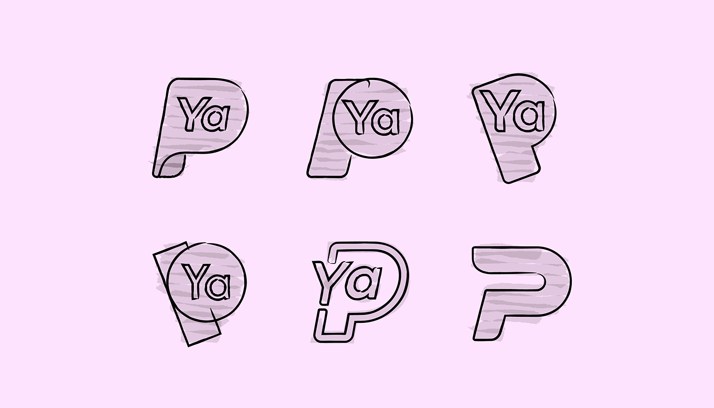
After pursuing a few different territories for the logo direction, the local management team decided to go with the concept of speed of delivery, and PedidosYa as one super-app for all online purchases as the vision for the future.
02— Stand out from the competition
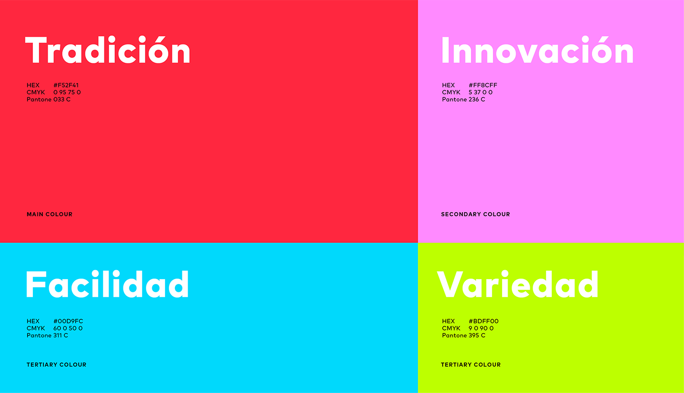
As the competition is getting stronger, so was the difficulty to stand out in a chromatic way, especially in the already busy streets of the five Latin American capitals, where Glovo and Rappi were going strong with Yellow and Orange palettes, and PedidosYa only had the colour Red to work with.

Althought the research has shown us that PYa red still had a lot of Brand equity and was something the team wanted to preserve, there was definitely a need to expand the colour palette and add more meaning to each of the four new colours.

03— Deliver Consistency
One of the biggest issues the brand has been facing is design consistency across all channels, so it was important to create not only a strong brand device but also a system and metaphor that would bring out the best of the new brand positioning and also create a simple way for the local design team to play around the creatives.

By dividing the logo into a grid of concentric lines, we created a simple series of 5 shapes, that used in different colours and ‘levels’ would create the system we wanted to have.


Three Key Brand Elements

Starting from the three key issues we needed to solve, we ended up with three levels of Key Brand Elements that together form the building blocks of the new design system.
The Brand Metaphor

Red de Transporte
We came up with their new Brand Book we call ‘Red de Transporte’, reflecting the Latin american metro system with each chapter representing a line and each piece in the brand guidelines representing a station.


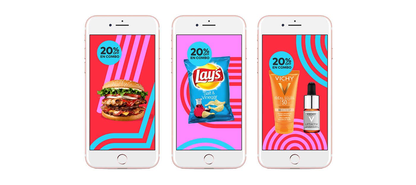
New Brand Creatives
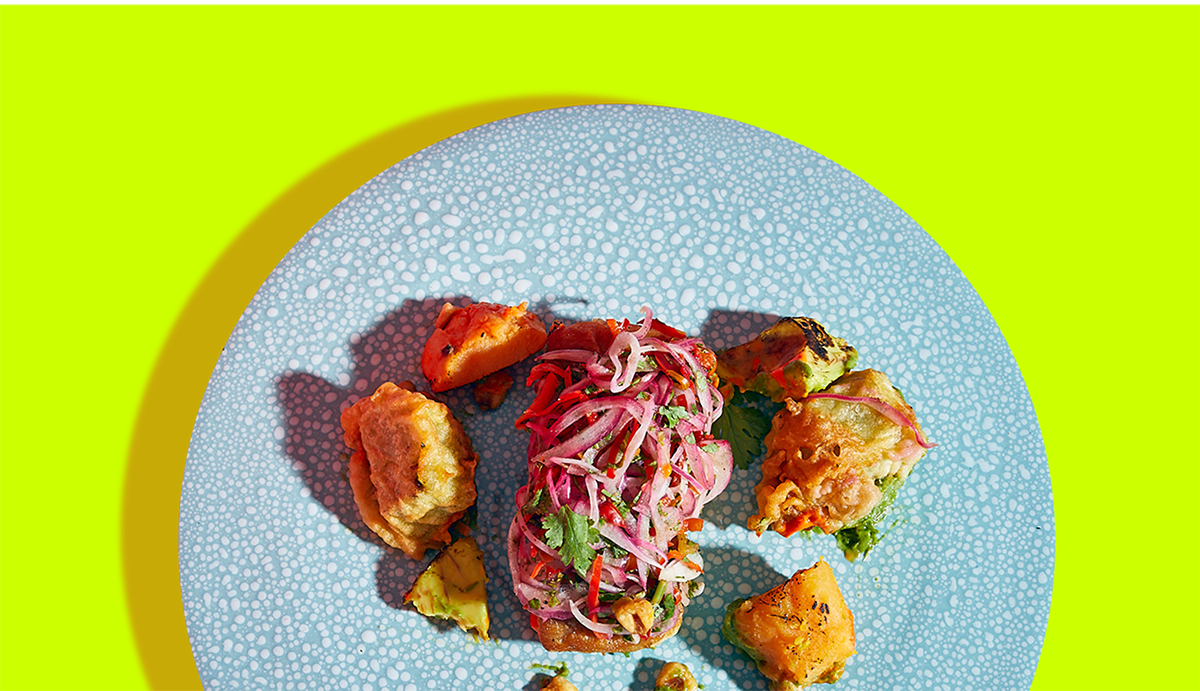
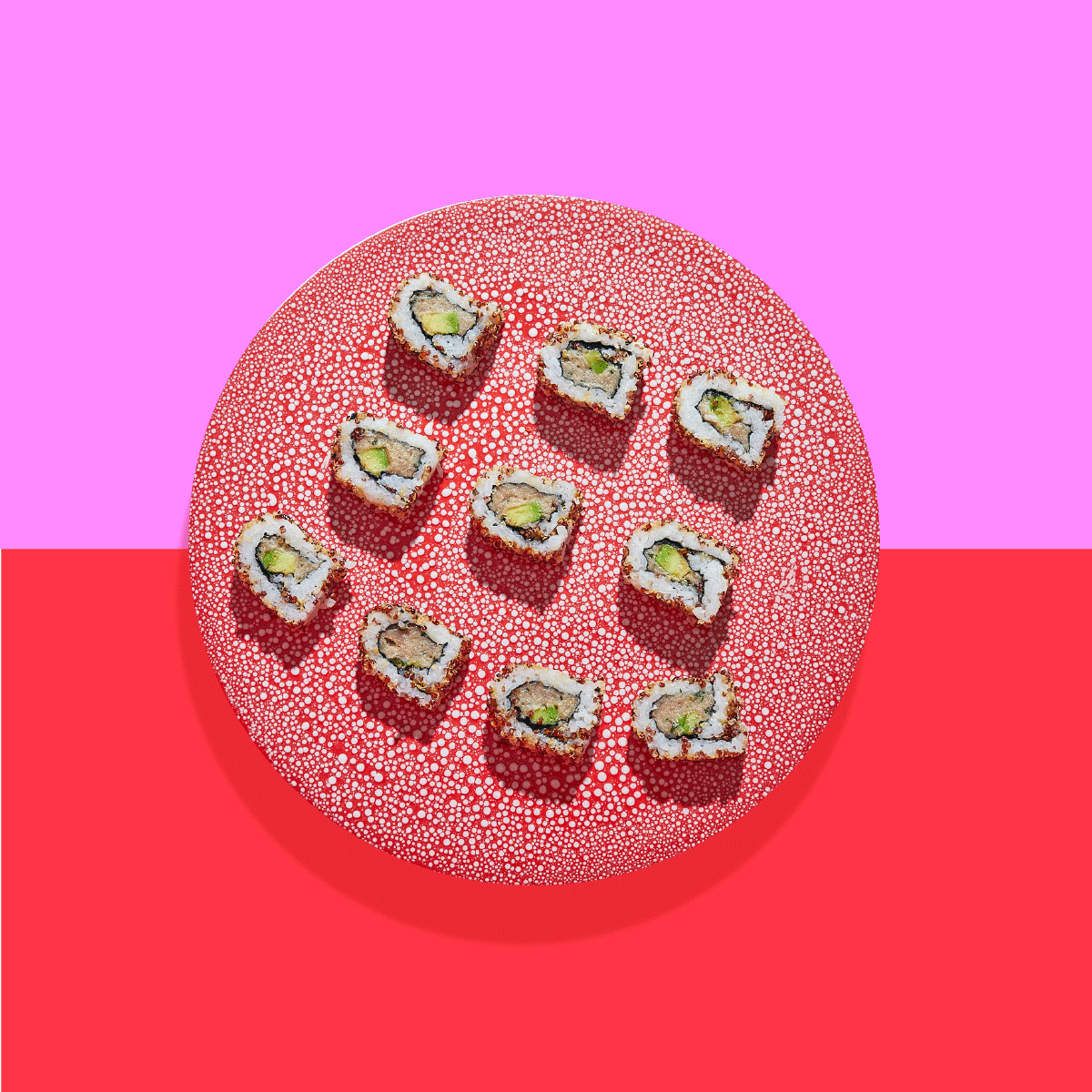
With the new colours and patterns in place, we rebranded all the assets they were using across marketing, in offline and online creatives to reflect the new brand and be able to compete with the ever-increasing new brands in the market.